IDRIC Impact Accelerator Project
Designing the concept chart for research framework
About the project
The IDRIC Impact Accelerator is a research project led by the University of Exeter, aimed at generating actionable knowledge for the industry and local communities to foster a placed-based and socially fair approach in the industrial decarbonization process. In this proje t, my role involves serving as a visual resource expert, responsible for visualising research concepts and outcomes through charts, graphics, videos, and other mediums.
Design methods
The initial design challenge was to create infographics aimed at enhancing the understanding of research findings and framework for workshop participants. These participants include community members, industrial stakeholders, and policymakers involved in the industrial decarbonisation process.
To visually represent and communicate the intricacies of the research idea and framework, I employed a structured design process to create the key concept charts for the workshop.
- Step 1: Understand research data and the target audience’s background
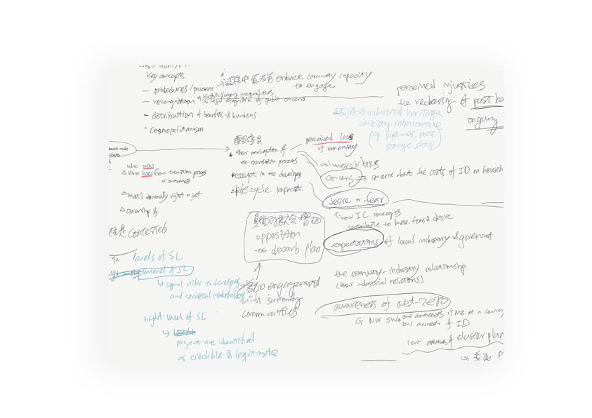
I met with the participating researchers during their synthesis workshop to comprehend the framework they are proposing. Subsequently, I utilized AI tools to swiftly extract and identify key concepts from pertinent documentation and analysed notes taken during the synergy workshop to integrate insights and perspectives gathered during the collaborative session. Additionally, I sought to understand the background and knowledge level of the target audience regarding the topic, in order to plan the necessary infographics for the follow-up workshops. - Step 2: Concept chart wireframe generation
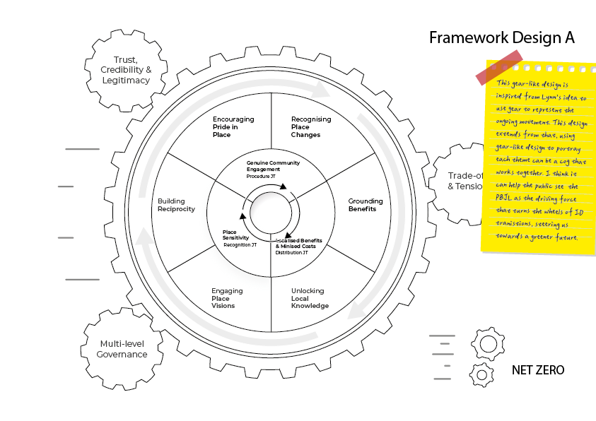
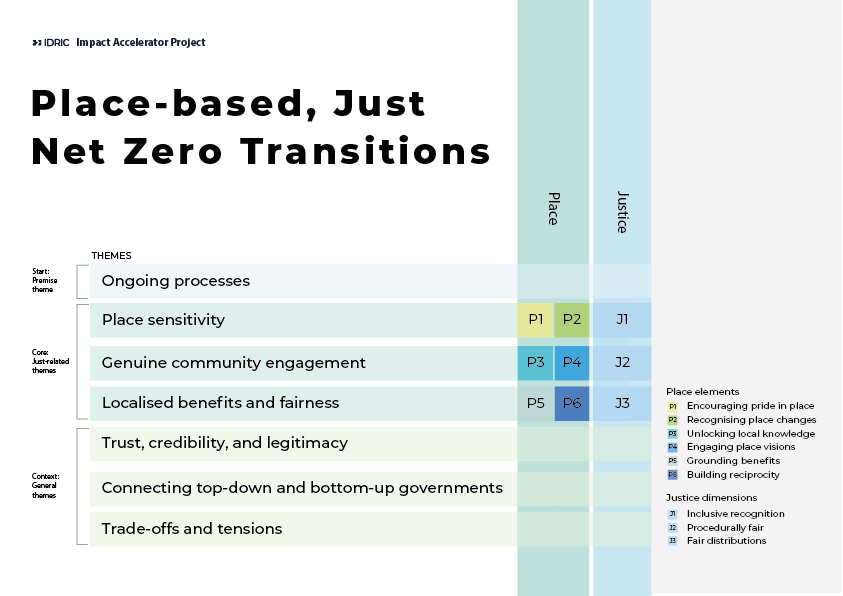
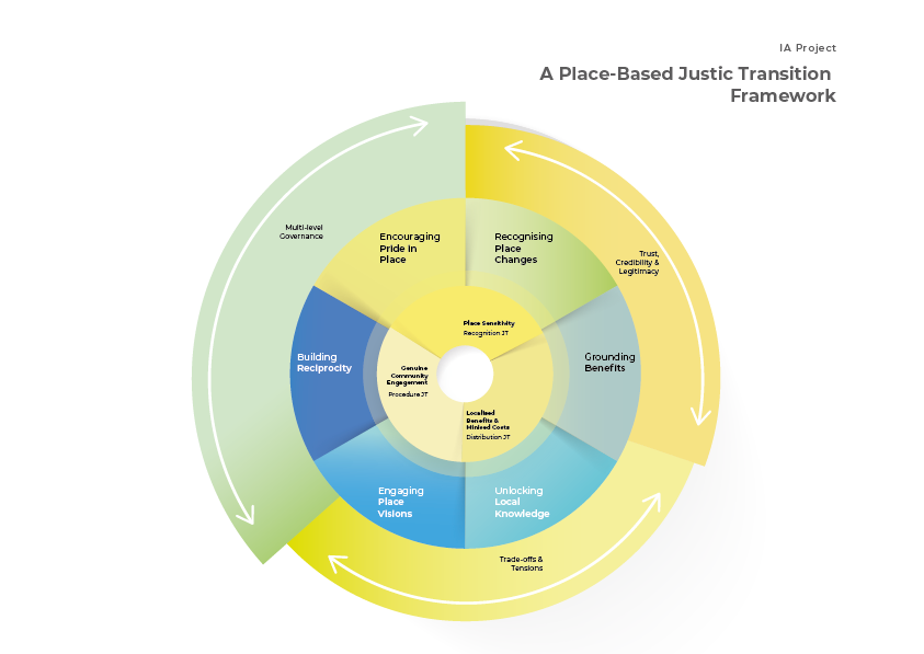
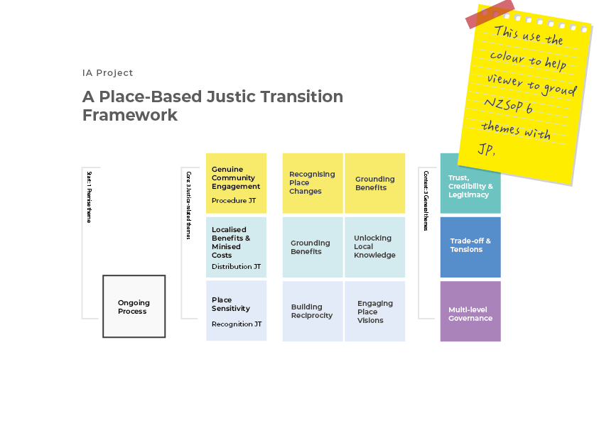
After the researcher confirmed the key themes in the proposed framework, I researched to examine how similar ideas were visually represented and addressed early design issues identified in initial discussions, aiming to develop an enhanced version. I then explored ways to visually represent the research framework, employing four different metaphors to create wireframes for rapidly communicating the key components and their relationships. - Step 3: Gathering feedback
To gather researchers’ feedback, the four concept chart wireframes were presented to researchers involved in the projects. I then refined the design and ensured alignment with the researchers’ vision. Furthermore, I conducted design preference tests to guide design decisions, assessing both the visual appeal and comprehensibility of the refined concept chart. - Step 4: Refinement and finalisation
I iteratively refined the designs through multiple rounds before reaching the finalisation stage. Following this, I created copies of the visuals in various formats to meet the workshop’s requirements.” - Step 5: Post-workshop review
I collected feedback from the workshop researcher to understand what improvements could be made following the initial workshop. Subsequently, I adjusted adjusted the color contrast of the chart, making it more accessible to the workshop environment.

Design outputs
Infographics
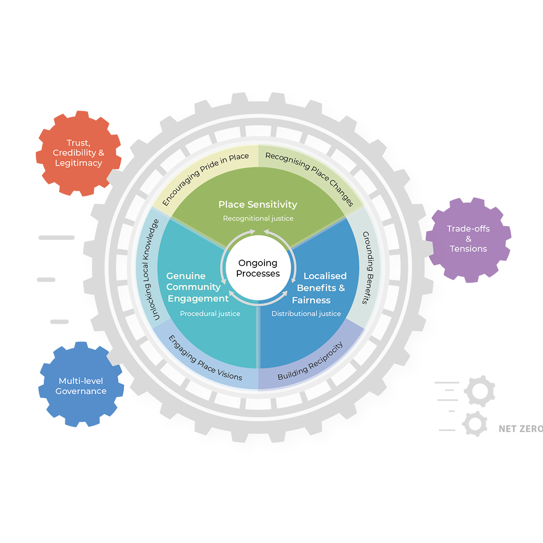
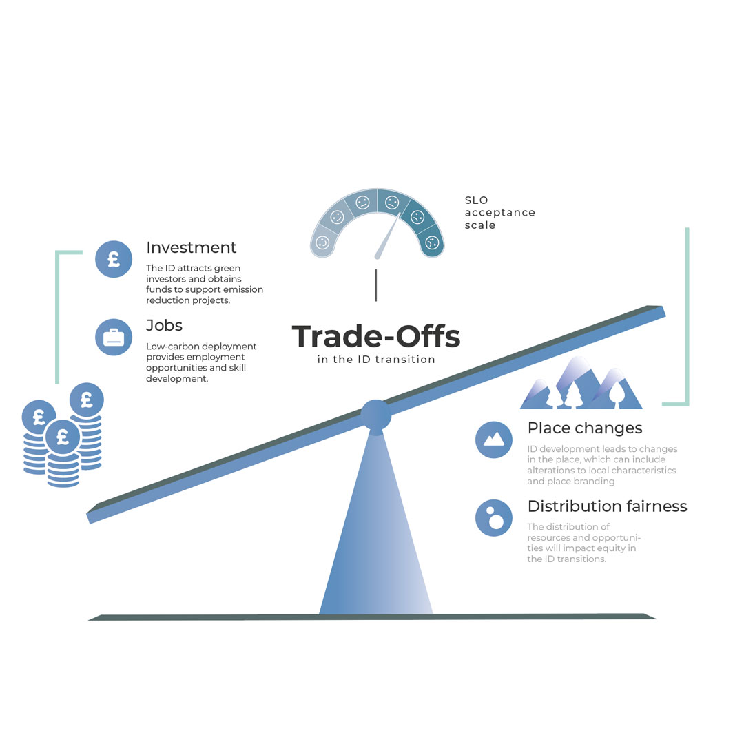
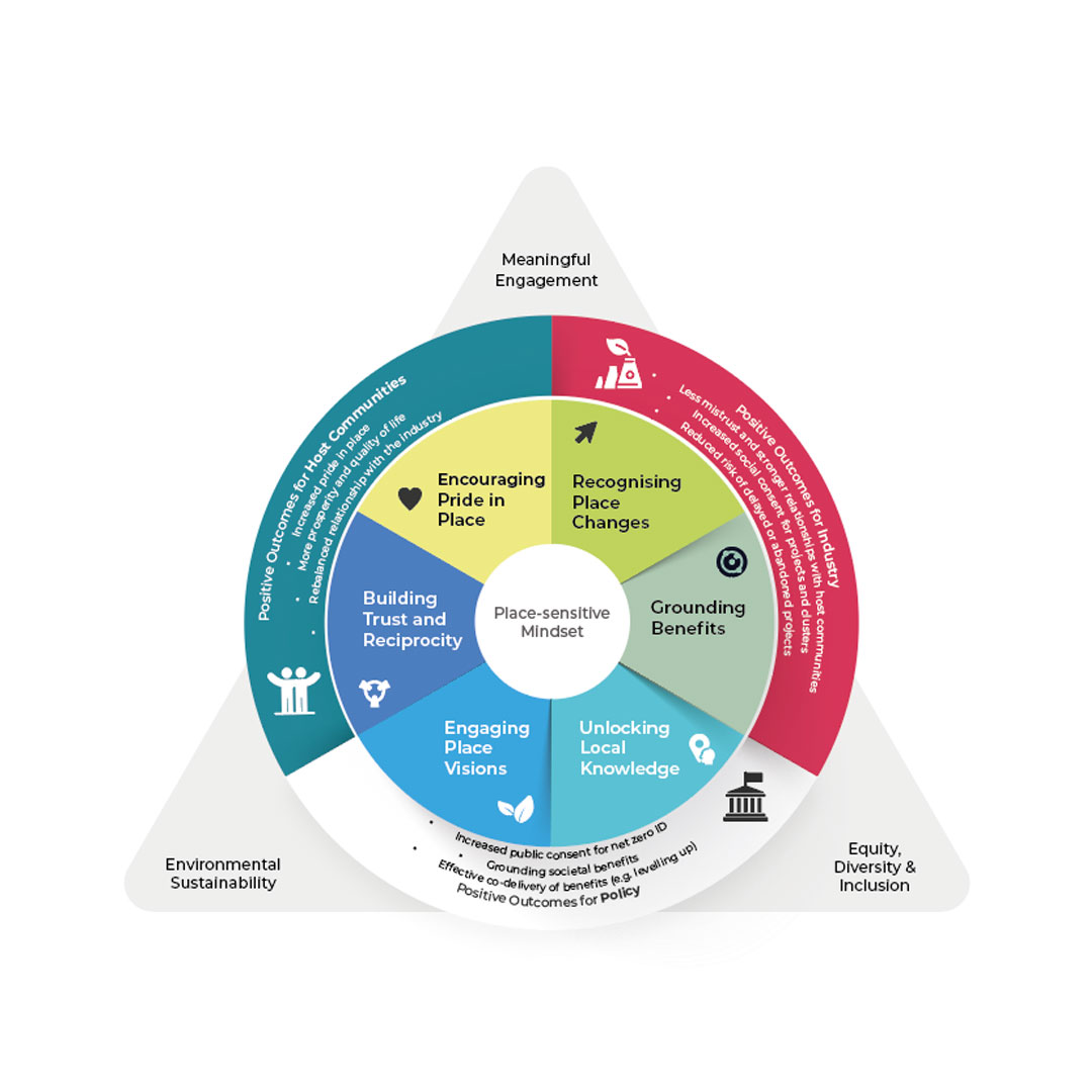
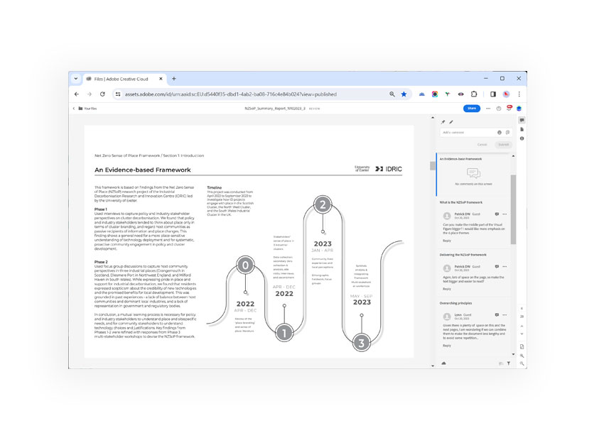
Brochures
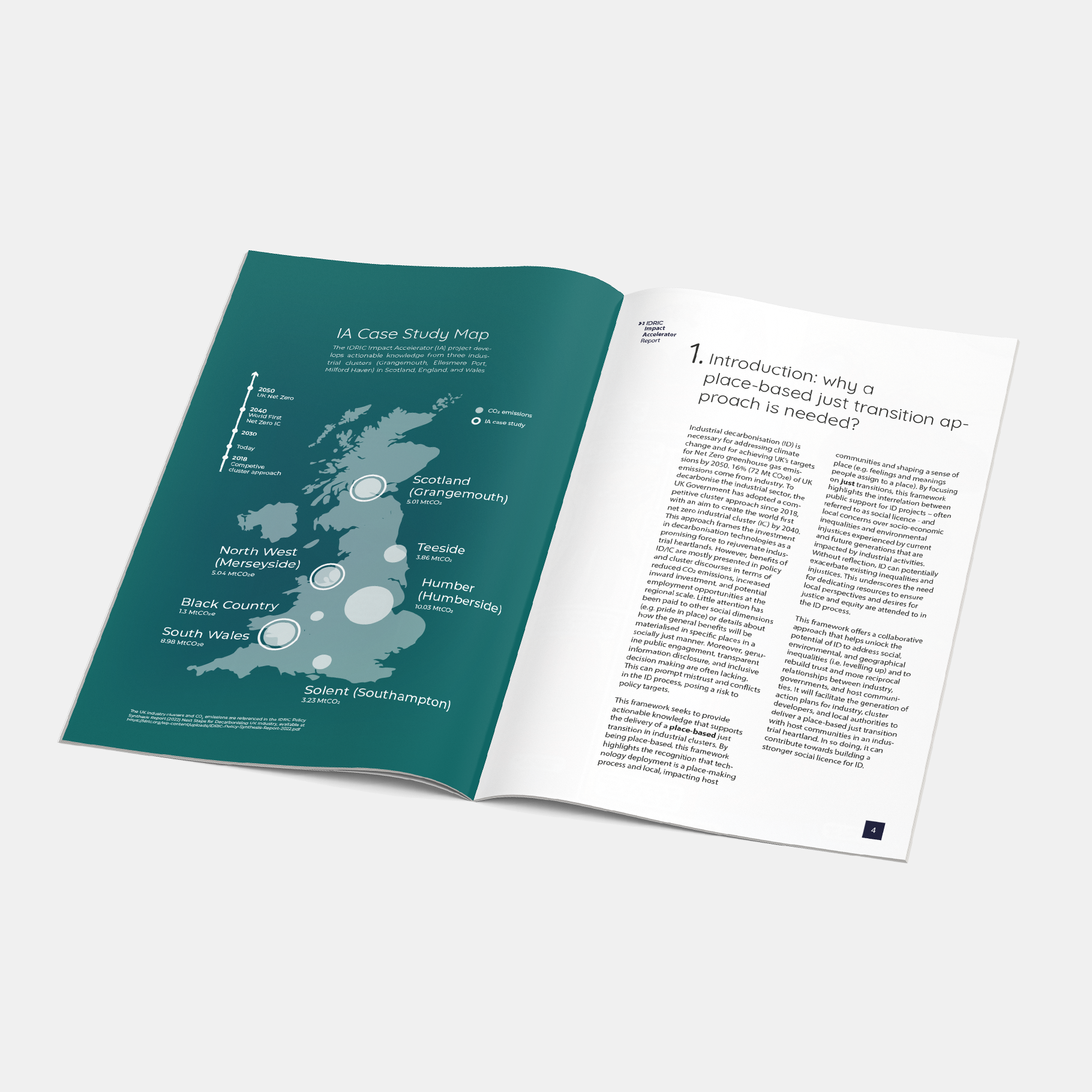
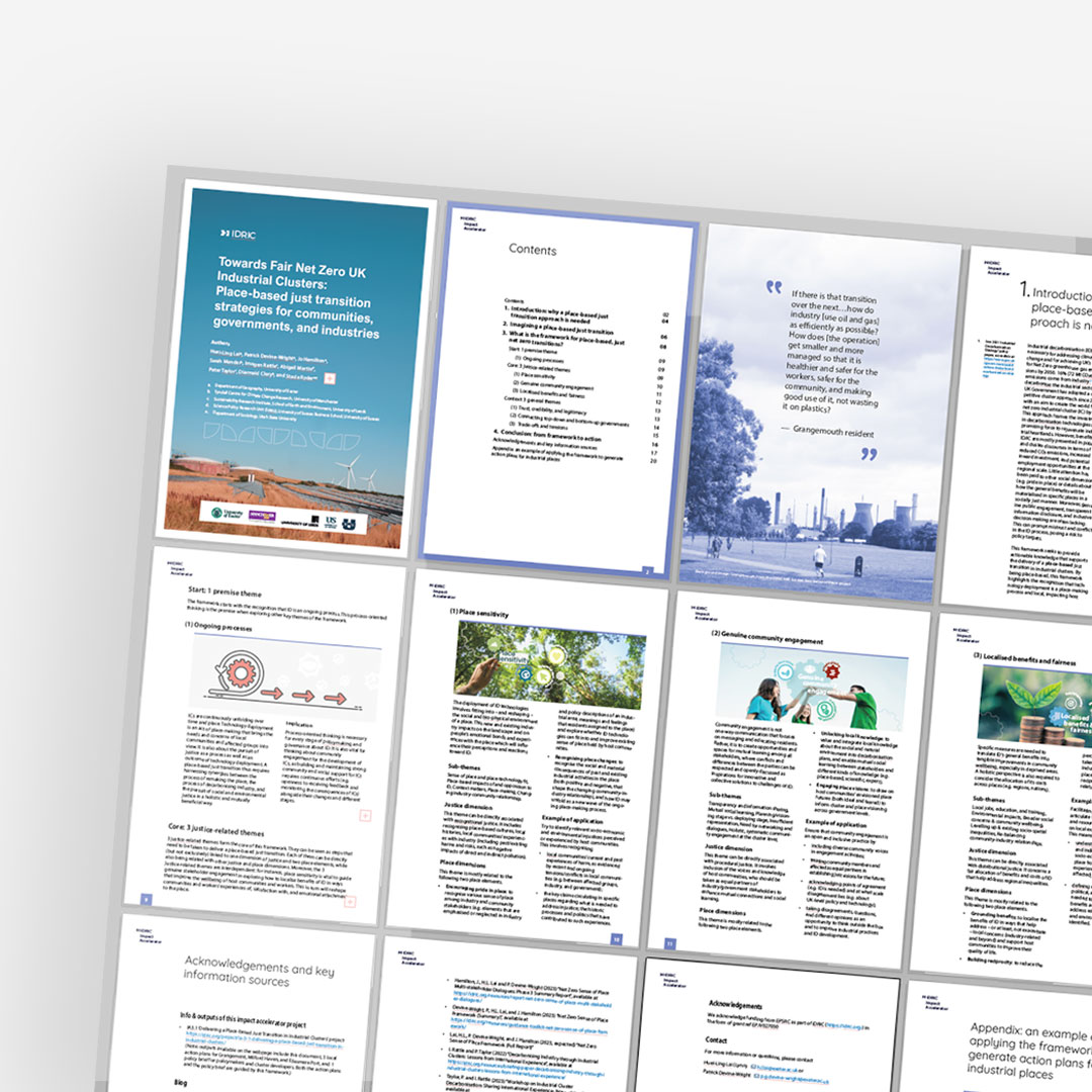
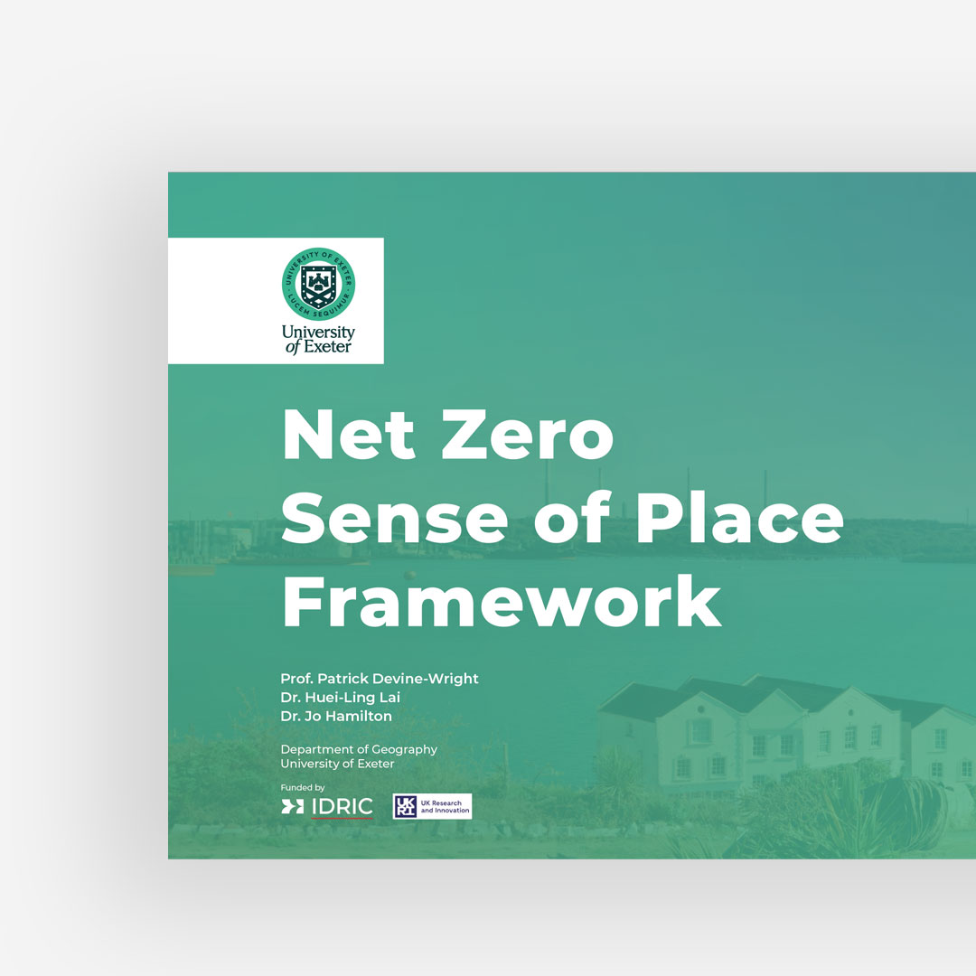
Presentations

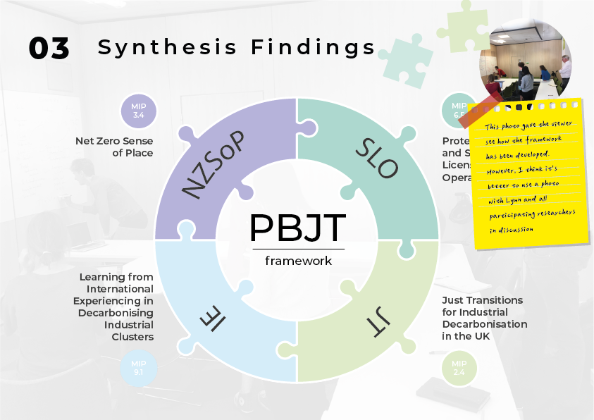
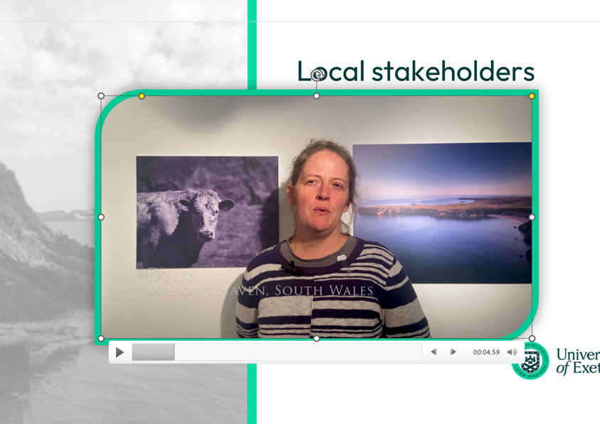
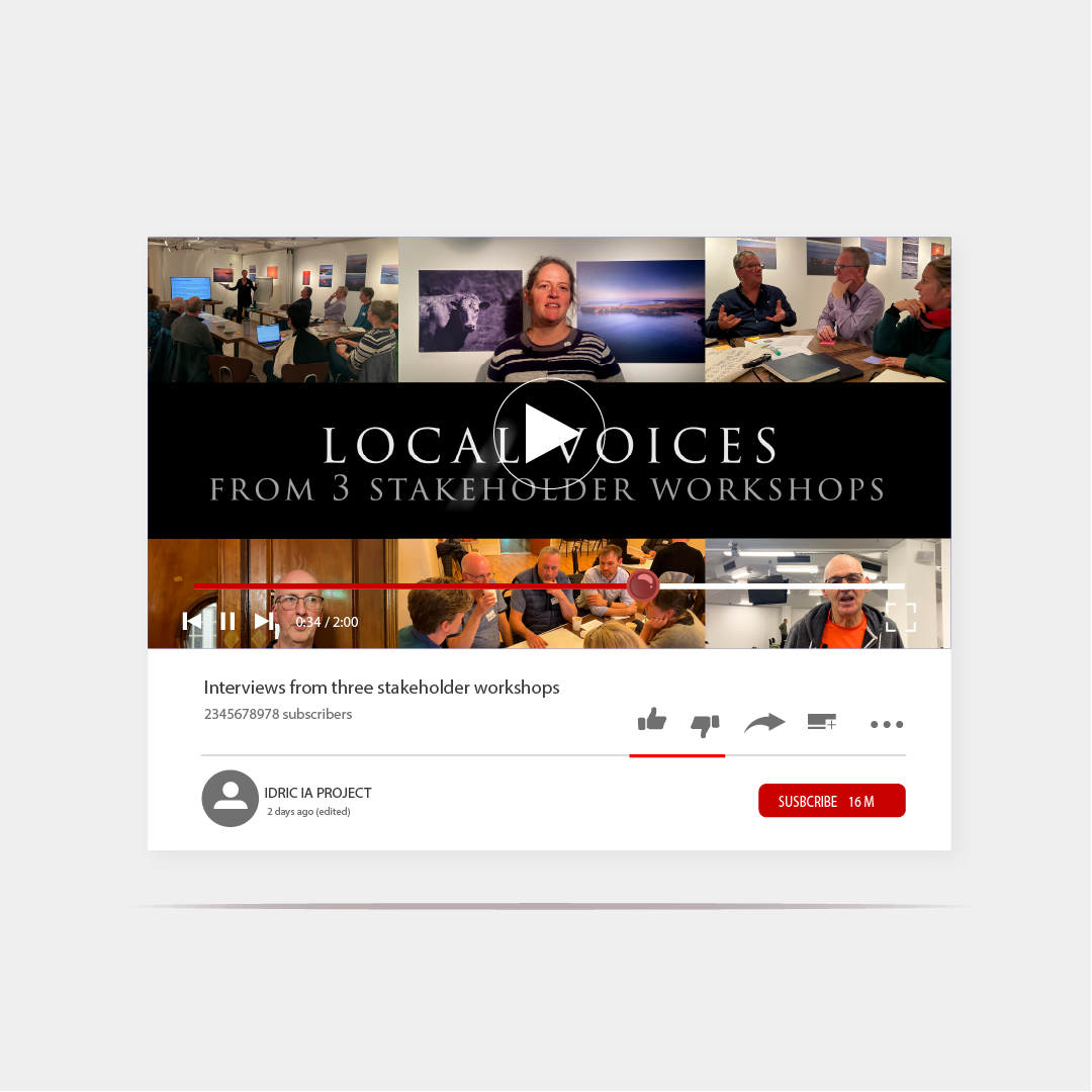
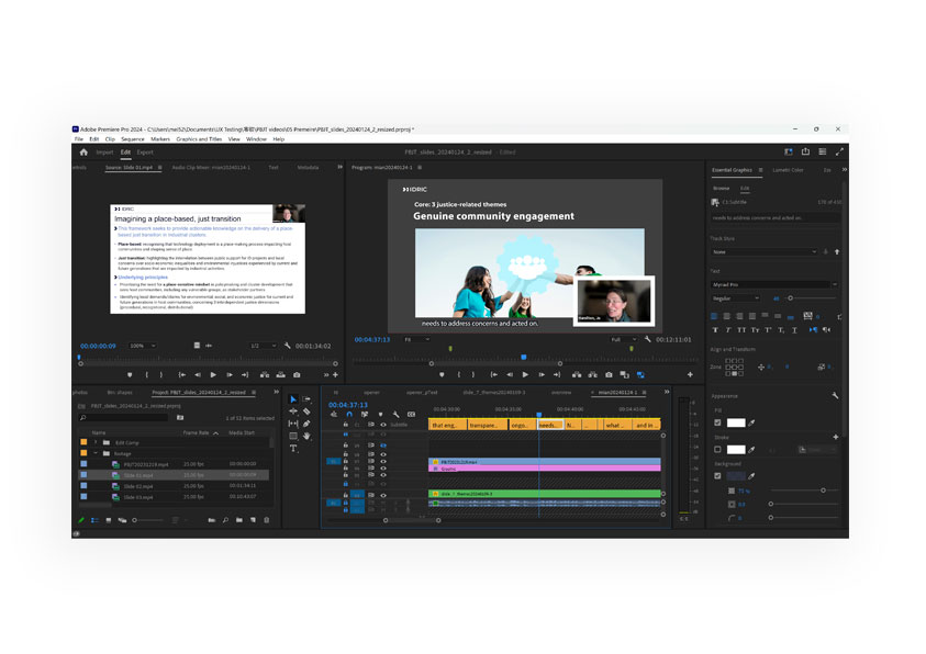
Videos
