ASSIT
Research visualisation and visual desgin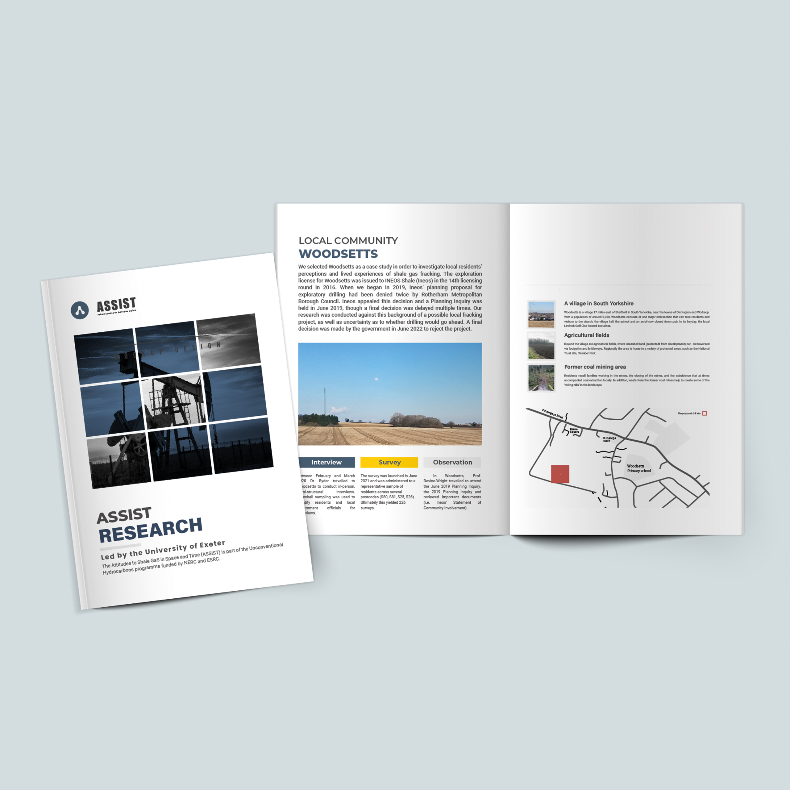
About the project
Project timeframe: JAN – MAR 2023
Role: Visual designer
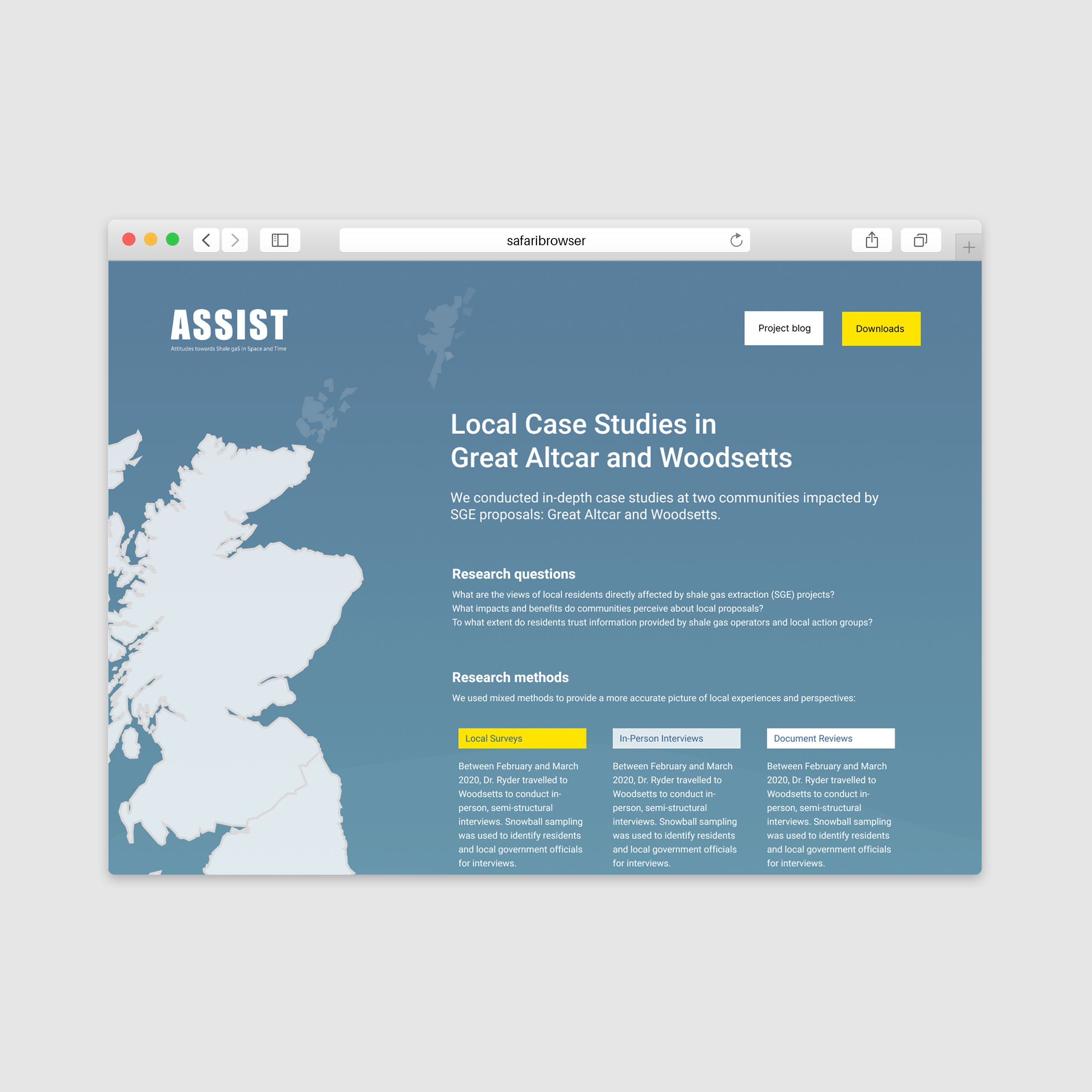
Project deliverables: charts, diagrams, prints (posters and brochures), a responsive website for visual data sharing
Skills: Content planning, visual design, Adobe Illustrator, Photoshop, Figma, Miro, and WordPress
The ASSIST (Attitudes to Shale gaS In Space and Time) project, led by researchers from the Universities of Exeter, Bath, Edinburgh, Heriot-Watt, Stirling, and Reading, investigates how public attitudes and community responses to shale gas evolve over time and differ across regions of the UK.
As a freelance designer, I collaborated with the team to translate complex research findings into clear and engaging visual outputs, including infographics, maps, and web design. The goal was to improve accessibility and enhance public understanding of the data.
Design process
Planning and Content Design
A significant part of the design process was dedicated to planning the structure and content of the visual materials. Since the research data was extensive and multifaceted, it required careful organisation before moving into visual design. I worked closely with the research team to define key messages, prioritise information, and map how different datasets could be visually represented in a coherent way.
User Research
The process began with reviewing the research goals and identifying how different audiences might engage with the outputs. I collected insights from the researchers to better understand their communication needs and the data stories they aimed to tell.
Ideation
Based on this foundation, I explored various layout structures and visual directions. The goal was to find the right balance between scientific accuracy, clarity, and visual appeal.
Prototyping
I developed wireframes to test different information hierarchies and colour systems. These drafts were shared with the research team for iterative feedback and refinement.
Testing
We conducted usability and design preference tests to evaluate which visual style best supported understanding and engagement. The results informed design adjustments that improved consistency and readability across all formats.
My Role
I was responsible for the overall UI design, data visualization structure, and integration of visual assets across both digital and print deliverables. This process helped ensure the final visuals effectively communicated complex findings to a wider audience.
Design Test
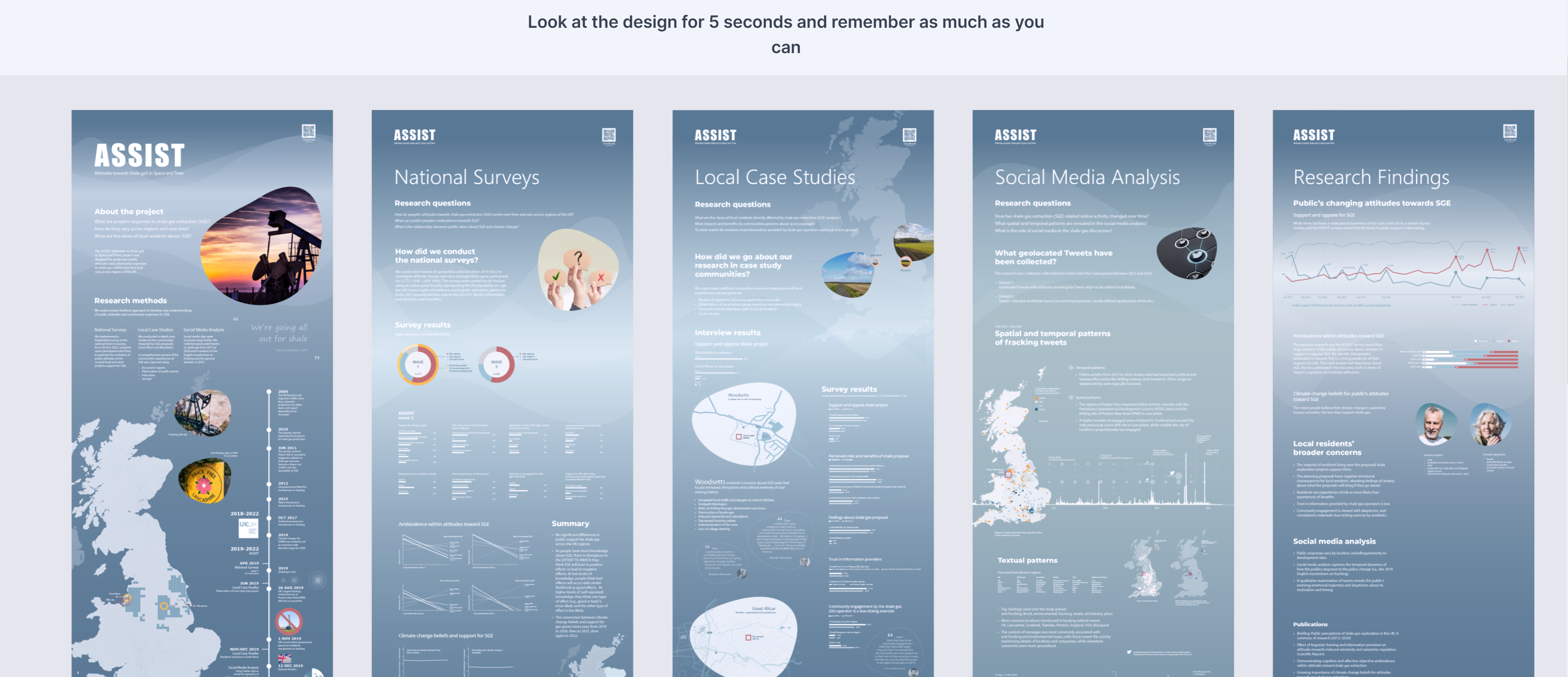
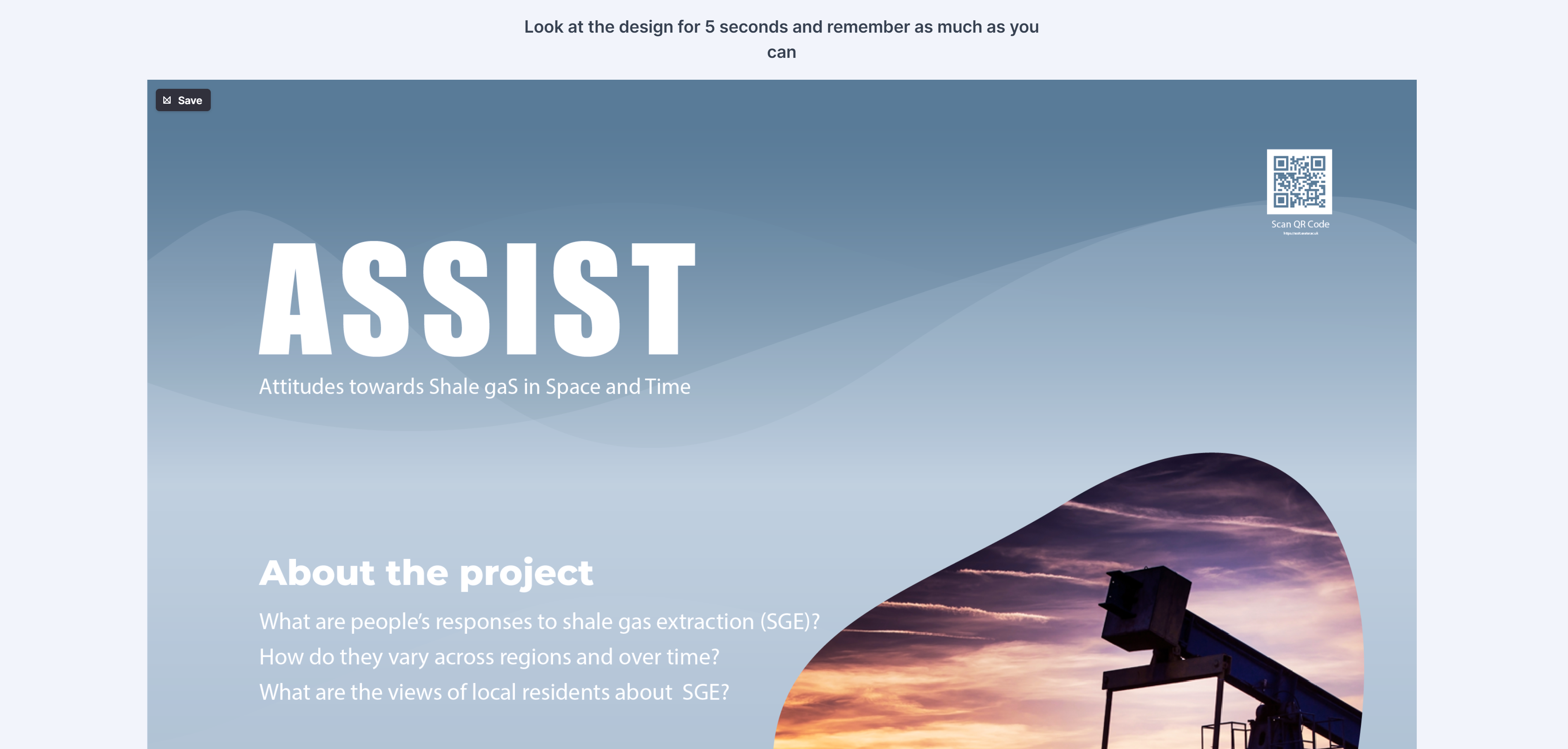
5-second test
Two 5 -second tests were conducted to understand what impressions people get from the design.
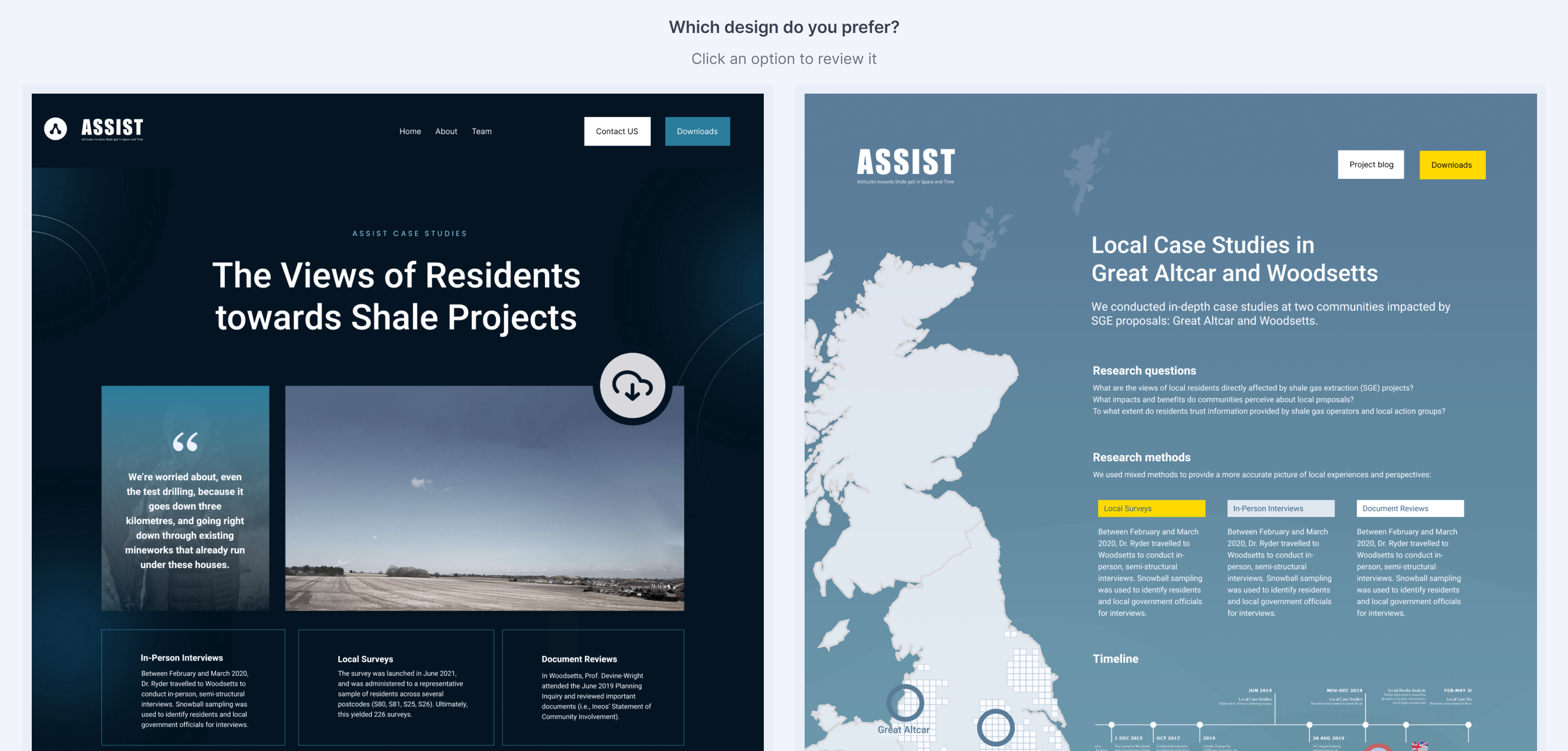
Design preference test
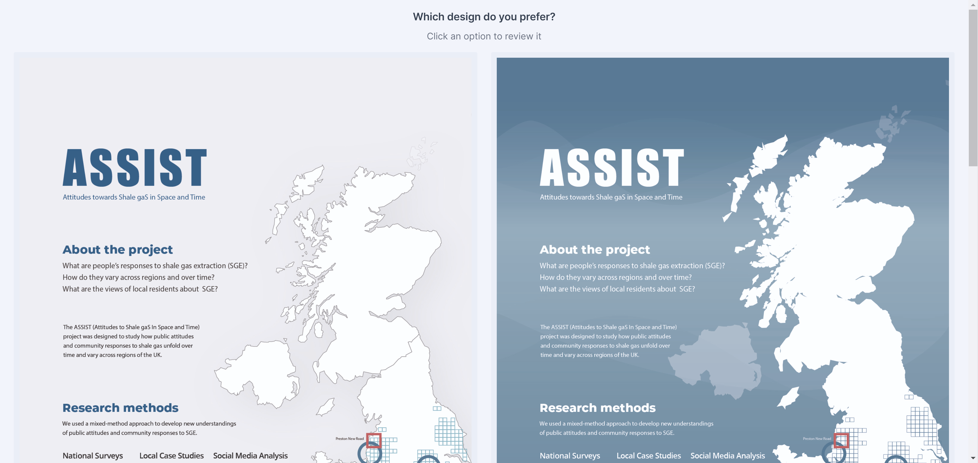
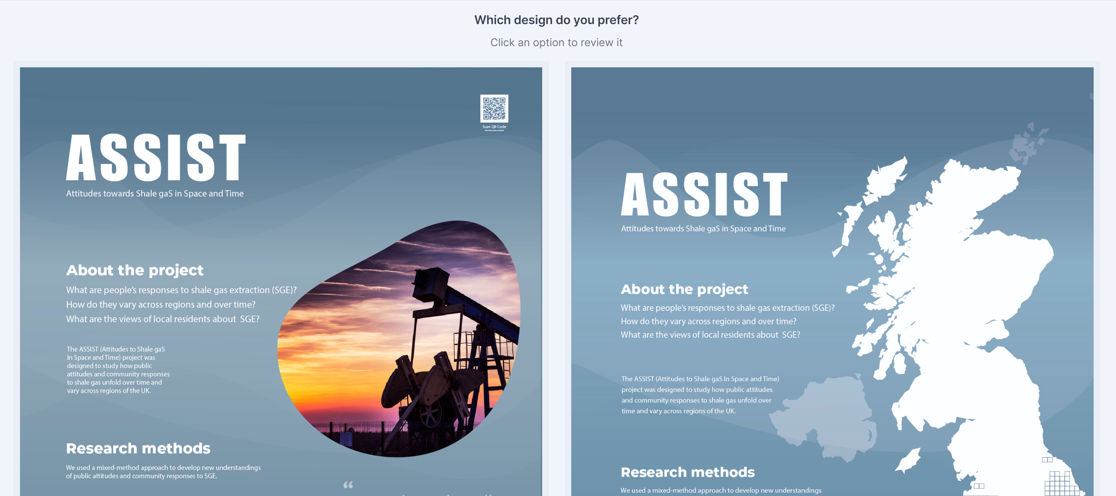
Several design preference tests were conducted to understand which design style was preferred by the participants.
Final deliverables
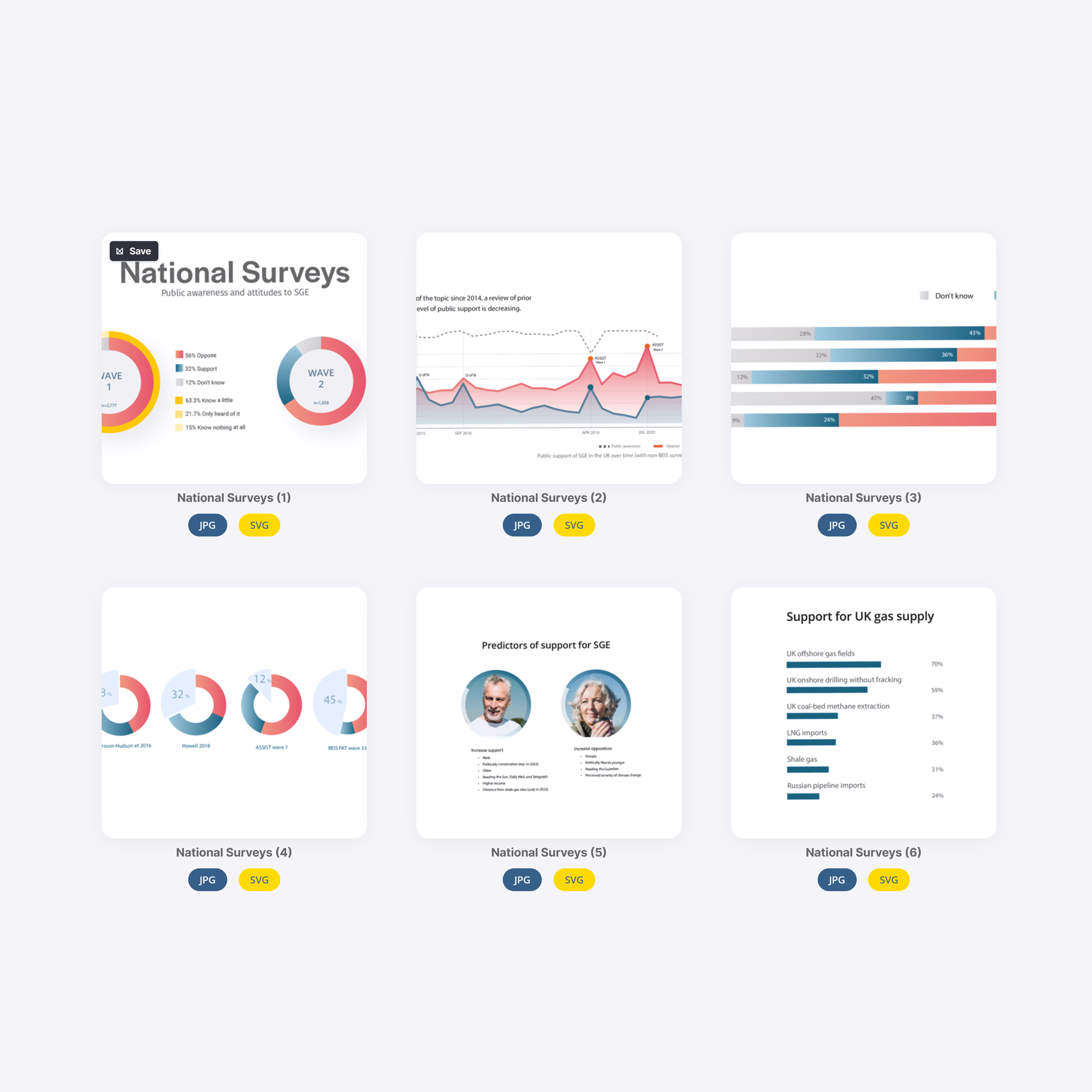
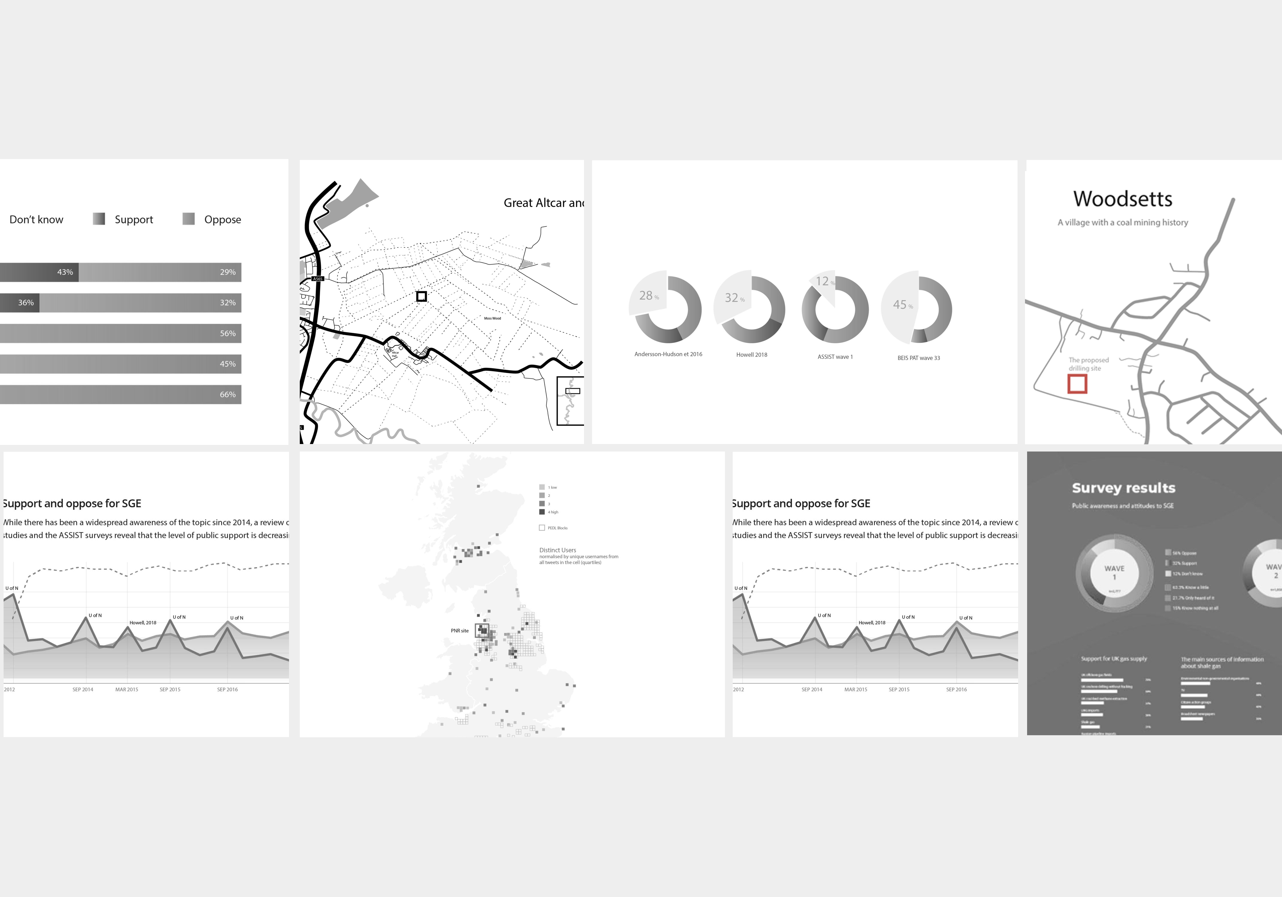
Infographics
Charts, diagrams, maps, etc
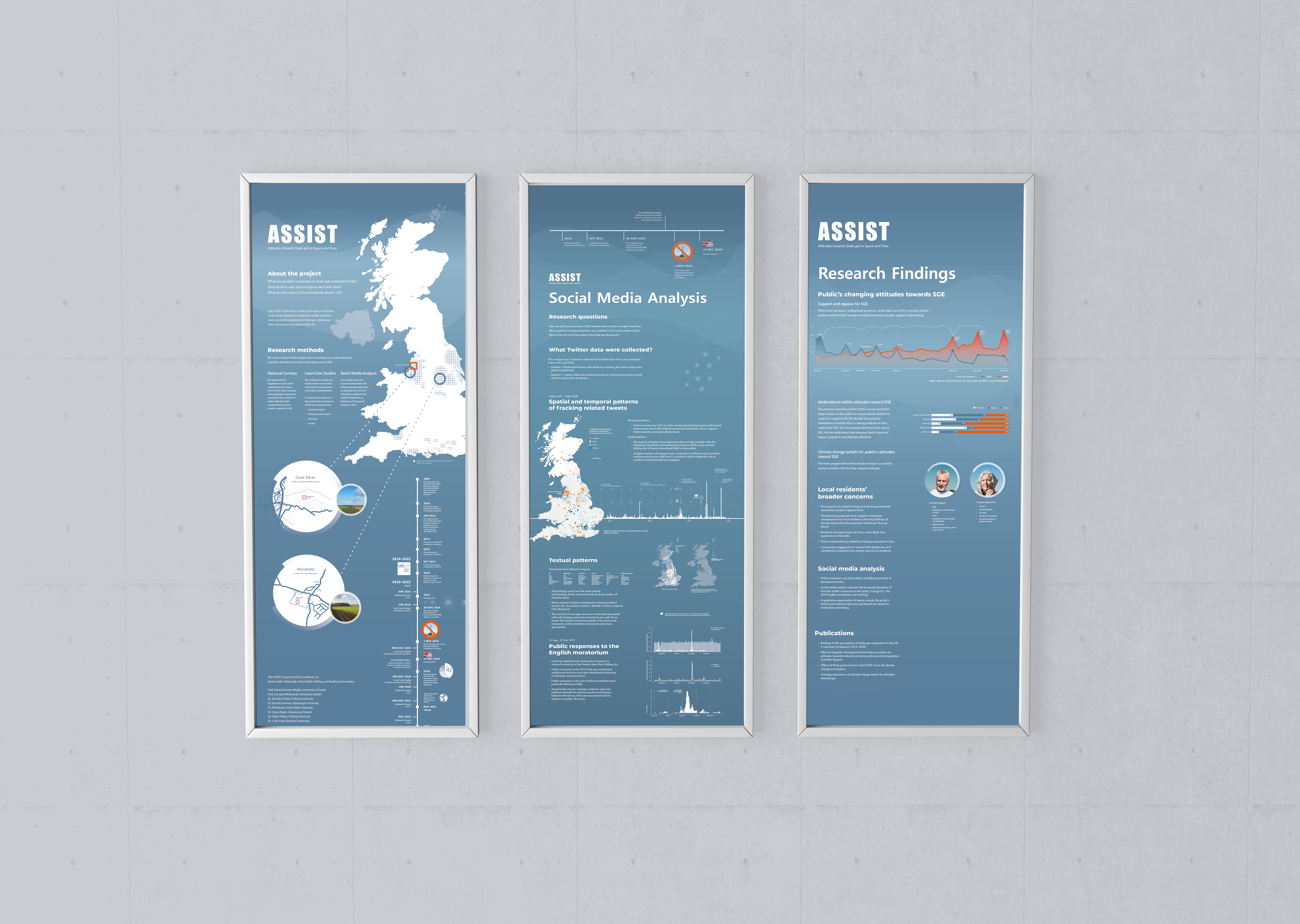
Posters
5 posters in two colour modes
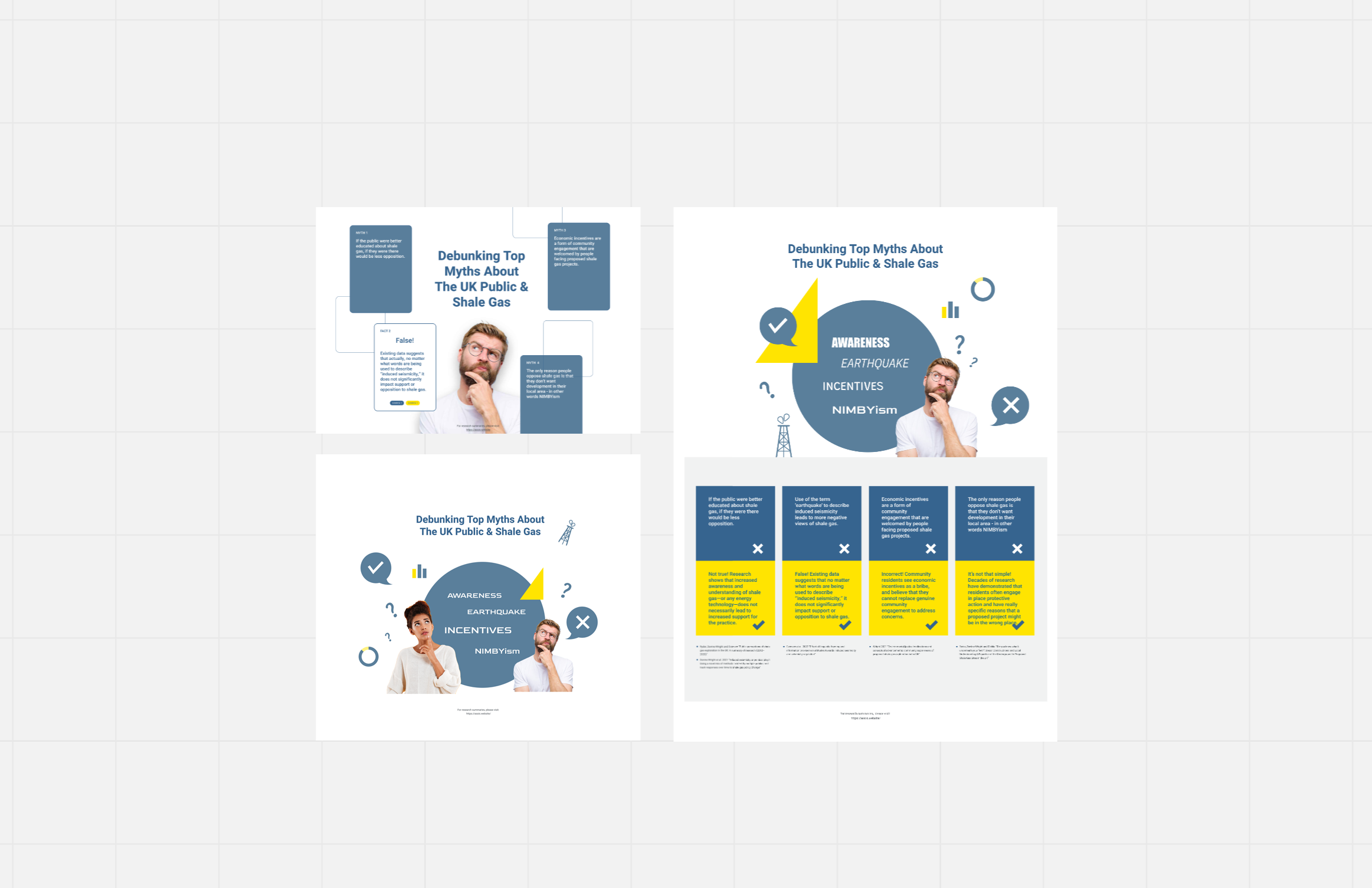
Myth debunking visuals
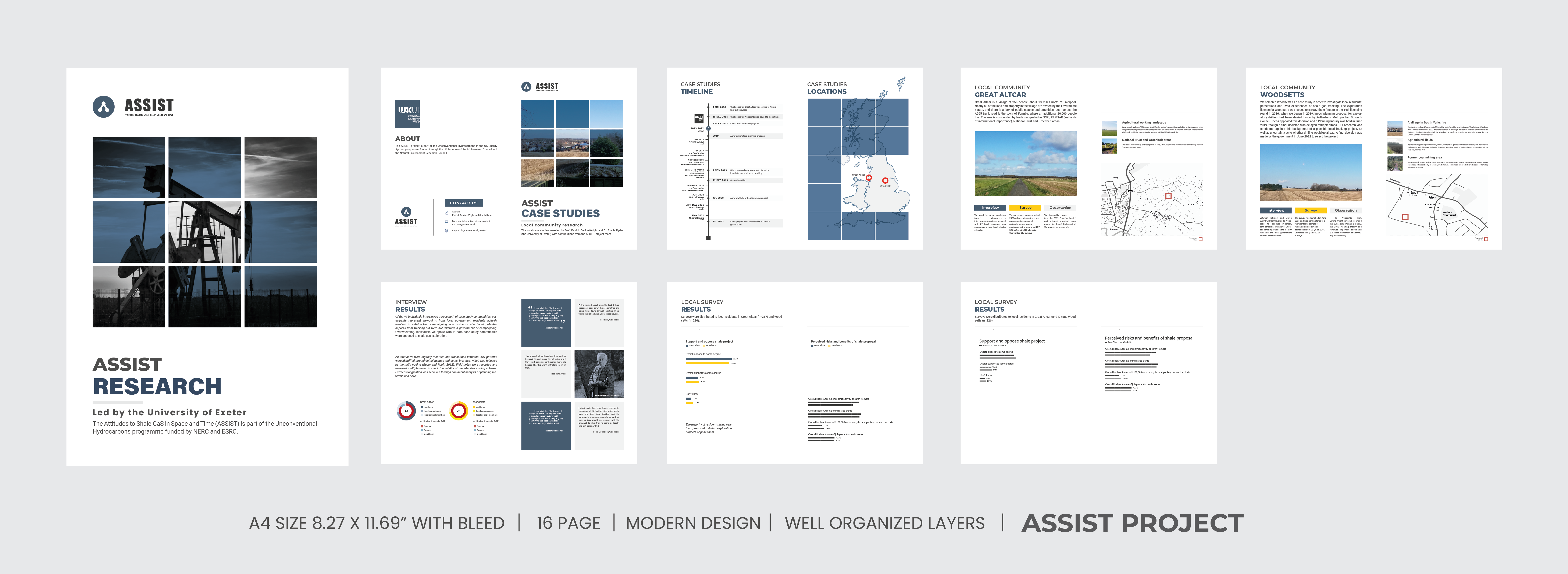
Brochures (A4)
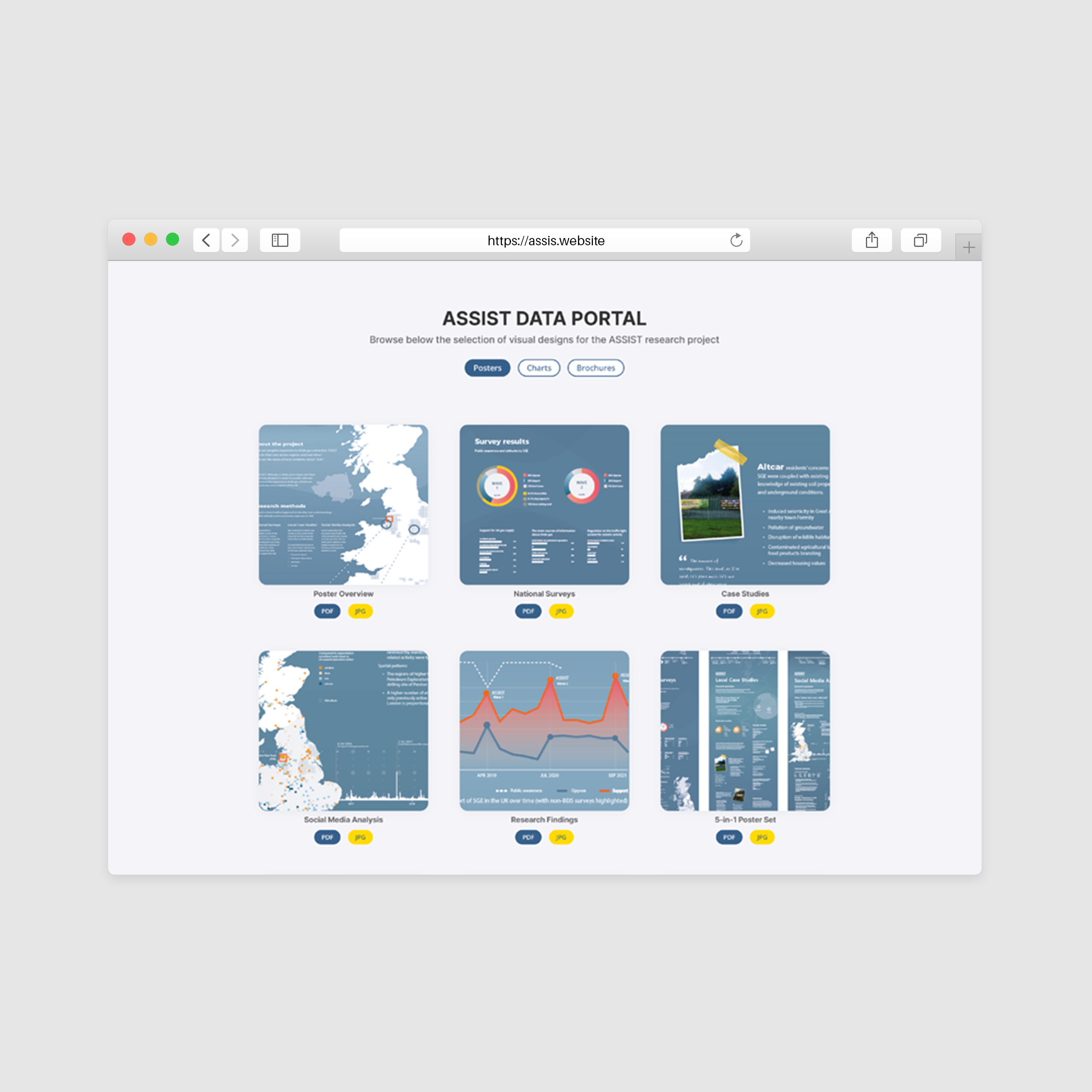
Visual data portal website
It is a live website at https://assist.creatives.sbs/. Currently, only the participating researcher is allowed to access the content.
